Ever wake up sick and just… dread the process? It’s not just the sore throat or the fever; it’s the stress of finding a doctor, guessing the cost, and hoping you can get a prescription filled before you feel even worse.
We all know that experience, but our Sick Day Index (SDI) proves that this experience is radically different depending on your zip code. Getting sick in America isn’t one experience: it’s 51 different ones.
The choice between a doctor and an urgent care clinic can be a simple preference in one city and a $200 mistake in another. In some states, a doctor’s visit is 74% cheaper than urgent care; in others, it’s over four times more expensive.
Two Sick Days: Same Symptoms, Different Outcomes
To see why this matters, imagine two people. They wake up on the same day with the same symptoms and the same urgent need to be seen.
- Person 1 lives in Atlanta, Georgia. If they go to an urgent care clinic, the cash price is about $61, or 1.08% of the area’s typical monthly income.
- Person 2 lives in Springfield, Illinois. They feel just as sick, but their urgent care stop costs $332, eating up 6.59% of a typical monthly paycheck.
Same symptoms, same day, but the financial burden is worlds apart.
Surprising Takeaways From the Index


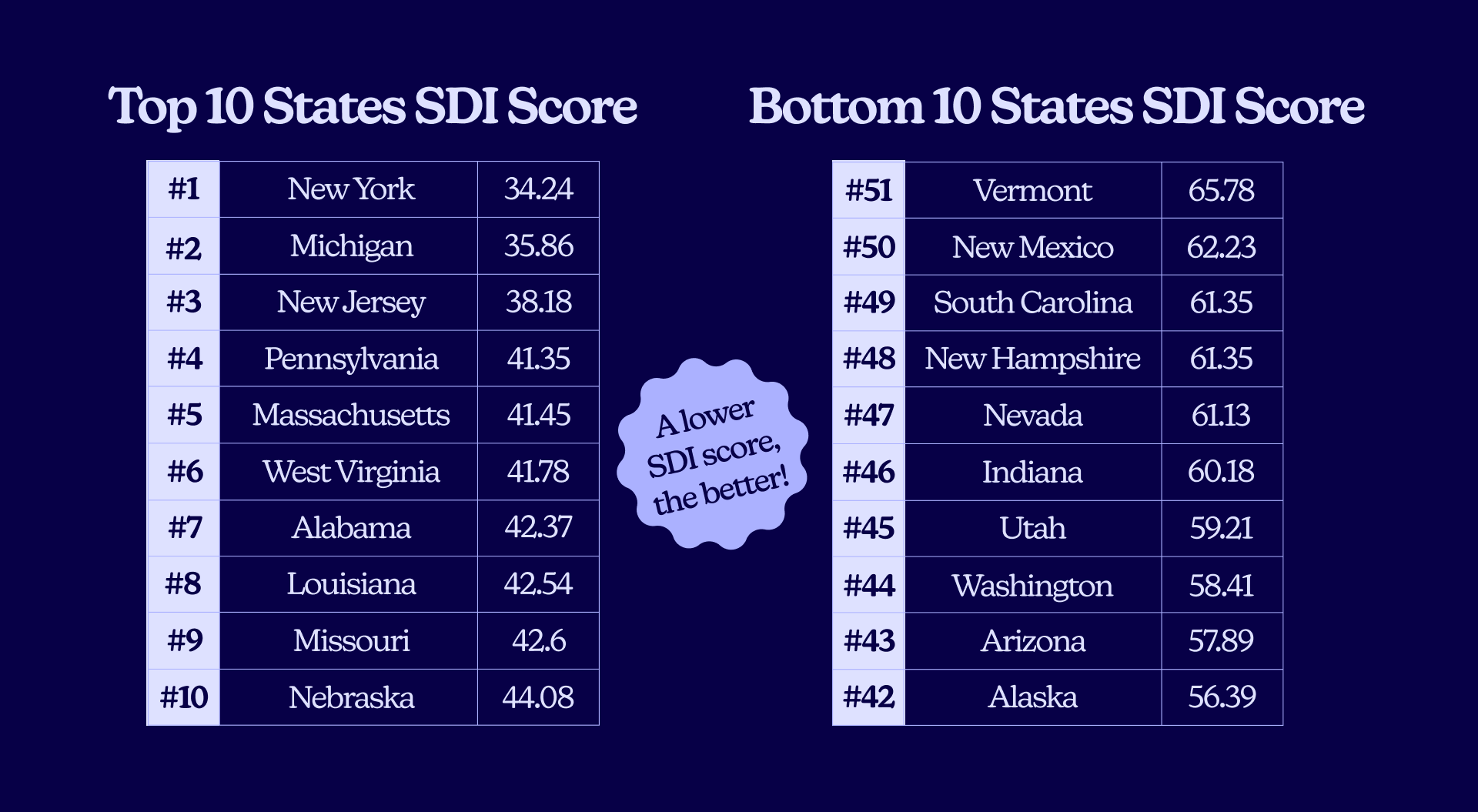
- The top 5 states for an easy sick day (lowest friction) are: New York, Michigan, New Jersey, Pennsylvania, and Massachusetts.
- The bottom 5 (most friction) are: Nevada, New Hampshire, South Carolina, New Mexico, and Vermont.
- Access to a primary care doctor is a critical factor, and the disparity is stunning. Our data shows a nearly 4x difference in physician density, from a high of 42.83 doctors per 10,000 people in Washington, D.C., to a shocking low of just 10.84 per 10,000 in Utah.
- Don’t assume urgent care is cheaper. In places like Des Moines, IA, and Baltimore, MD, seeing a doctor can be over 60% cheaper. But in Atlanta, GA, and Orlando, FL, that same choice will cost you: a doctor’s visit is 167% to 348% more expensive.
- Getting a prescription is not a given. We found a 2.8x difference in pharmacy access, from 3.38 pharmacies per 10,000 in North Dakota to a low of 1.19 per 10,000 in Oklahoma.
- A state’s overall rank can hide surprising strengths and weaknesses. Mississippi (Rank 30), a state with many healthcare challenges, actually has the most hospital beds per capita in the nation (30.41 per 10k). Meanwhile, a wealthy state like Washington (Rank 44) is near the bottom for bed availability (13.22 per 10k).
Our Method: What Makes a ‘Sick Day’ Easy or Hard?

The Sick Day Index (SDI) is built to answer the questions you ask in that moment of stress: “How fast can I be seen? How much will it cost? And how hard will it be to actually get my medicine?”
We folded dozens of variables from our data into five key pillars. For the final SDI score, lower is better, meaning faster, cheaper, and easier care. Here’s what we measured:
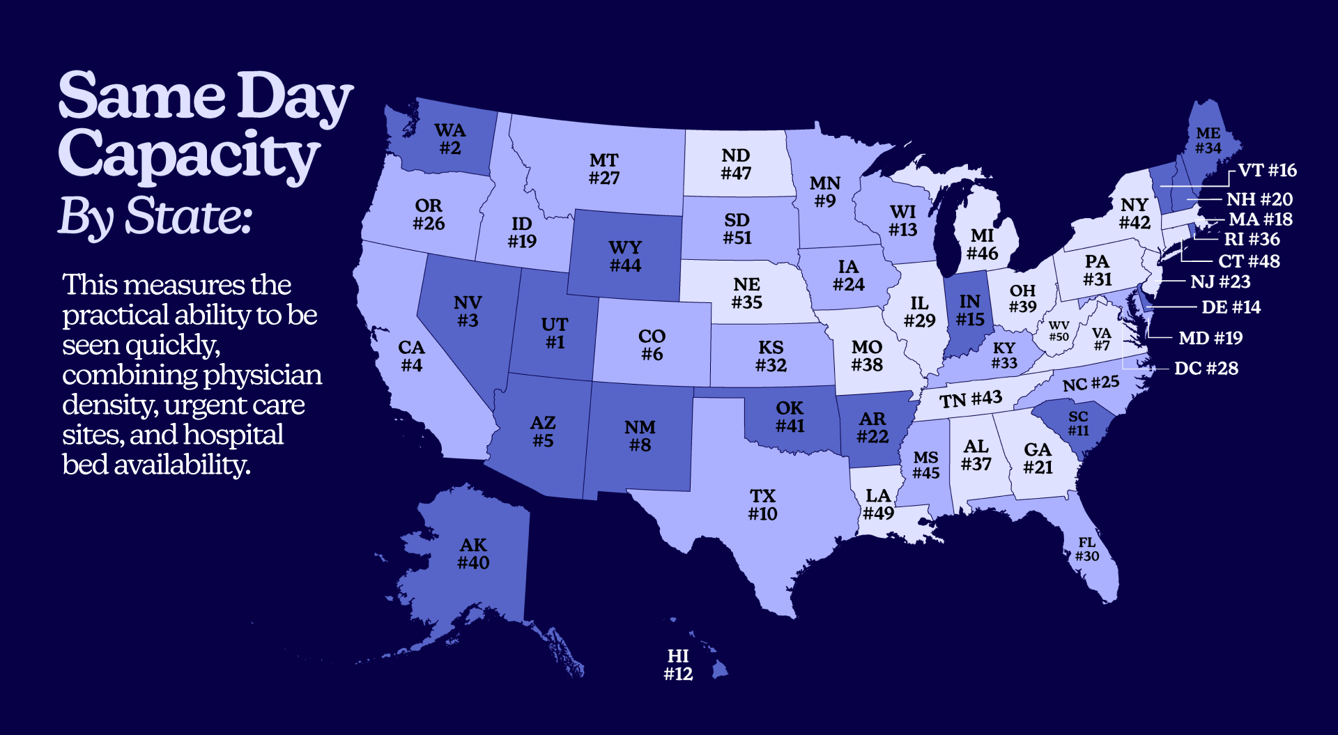
- Same Day Capacity (Can I get an appointment today?) This measures the practical ability to be seen quickly, combining physician density, urgent care sites, and hospital bed availability. As research shows, every 10 additional primary care physicians per 100,000 people is associated with a 51.5-day increase in life expectancy, making it the most critical measurement.
- Fulfillment Access (Can I get my prescription?) A doctor’s visit is essentially useless if you can’t access the prescriptions you need. We used pharmacy density as a proxy for this. When pharmacies are too few or too far, people don’t pick up their prescriptions, and studies show these closures cause persistent, clinically meaningful drops in medication adherence.
- Financial Barrier (How much will this cost me?) This blends cash prices for a COVID test at a doctor’s office and urgent care with local income (HHI) and uninsured rates. A $200 bill is not the same in a metro area in California (average HHI $130,730) as it is in Mississippi (average HHI $48,268). This is why uninsured adults are far more likely to delay or skip needed care.
- Geography Friction (How far do I have to drive?) This score captures the penalty of distance and rurality. This is a direct function of how rural a state is. This friction is a top reason why remote rural areas have up to 57% higher rates of preventable hospitalization. People simply wait too long because access is too hard or unattainable.
- Digital Access (Can telehealth help?) This measures broadband and mobile network coverage. Can you reliably use telehealth? If care is unavailable in person, can you turn to online providers to fill the gap? Emerging evidence links broadband expansion to better health outcomes.
Where the Overall Sick Day Experience Is Best and Worst
What do the top states get right? In a word: balance.
A cluster of Northeastern and Great Lakes markets post the strongest scores. They combine high capacity with strong digital access and healthy pharmacy density. This “operational slack” takes the pressure off single weak points.
- In New York (Rank 1), high provider density and great broadband mean you find a slot faster. Plentiful pharmacies and reasonable prices mean you’re not on a second scavenger hunt to get your prescription and you can likely afford to pick it up.
- In Michigan (Rank 2) and New Jersey (Rank 3), capacity and digital access make the start of the visit smooth, giving you time to manage costs instead of making a last-minute, expensive decision.
- Pennsylvania (Rank 4) and Massachusetts (Rank 5) round out the top tier, where near-universal high-speed internet combines with a deep bench of providers.
When these conditions stack up, even a moderate price feels doable because the process doesn’t fall apart.
State Profiles Revealed
Here are the full rankings for all 51 states (including D.C.).
Remember: A lower SDI Score is better. The costs shown are cash prices for an uninsured visit for a simple non-CDC COVID test.
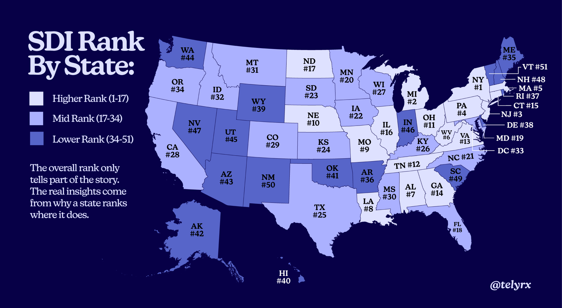
The overall rank only tells part of the story. The real insights come from why a state ranks where it does. Three patterns reveal why some states struggle despite seeming advantages.
The Provider Paradox in Utah (Rank 45)
At first glance, Utah’s low rank is a mystery. It has the single best “Same Day Capacity” score (89.78) in the entire nation, driven by a strong urgent care and hospital infrastructure. So why is it ranked 45th? Because it also has the single worst “Physicians Per 10,000” (10.84).
This is a state built for episodic, urgent issues but is failing at foundational primary care. This critical shortage of physicians creates a massive barrier, torpedoing its overall score despite its infrastructure strengths.
The Rural “Double Whammy” (Wyoming & Vermont)
This is the trap of being both rural and disconnected.
Vermont (Rank 51) and Wyoming (Rank 39) have some of the highest Geography Friction scores (95.0 and 75.2, respectively) due to their high rural populations. The obvious solution to this distance problem is telehealth.
But these same states also have the worst “Digital Access” scores in the nation (90.14 and 92.48). They are the states most in need of a digital solution but are the least able to access it. This “double whammy” makes it nearly impossible to overcome the friction of distance, guaranteeing a difficult sick day experience.
The Financial “Double Hitter” (Texas & Florida)
This is the toxic combination of high costs and high uninsured rates.
Texas (Rank 25) has the highest uninsured rate in the nation at 16%. This is paired with a high Financial Barrier score (57.74), driven by high costs relative to income. Florida (Rank 18) has a similar story: a very high uninsured rate (11%) and one of the worst “cost flip” scenarios, where a doctor visit ($280) is nearly 3x the cost of urgent care ($105).
In these states, millions of people face the highest risk of a massive bill (being uninsured) in an environment where those bills are already high. It’s a recipe for delaying care until the problem becomes a crisis.
The $200 Mistake You Might Be Making
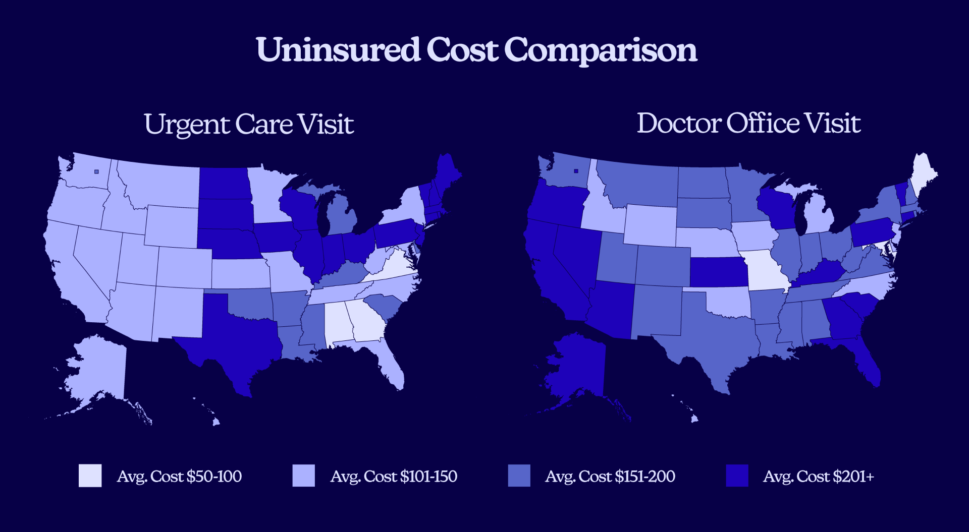
Many people assume urgent care is the cheaper option for a quick visit. Our data shows that can be a dangerously expensive assumption. The “right” choice is entirely dependent on your zip code.
When Seeing a Doctor Saves You Money
In many markets, the old-school doctor’s visit is the clear financial winner.
- In Portland, ME, the uninsured would save 74% by seeing a doctor ($63) over visiting an urgent care clinic ($243).
- The same pattern holds in Baltimore, MD (62% cheaper), Des Moines, IA (66% cheaper), and Kansas City, MO (50% cheaper).
When Urgent Care Is the Better Bet
The reverse pattern is just as extreme, showing why this is so confusing for patients.
- In Atlanta, GA, a physician visit costs a staggering 348% more than urgent care ($273 vs. $61).
- This trend also appears in Richmond, VA (205% more), Reno, NV (177% more), and Orlando, FL (167% more).
In most cases, calling both offices is the smartest five-minute move you can make.
Why Price Burden Matters
Price Burden combines price with income. A $200 bill doesn’t feel the same in every city. Our data shows that an uninsured doctor visit in Orlando eats up 5.82% of a typical monthly income. In Baltimore, that same burden is only 0.84%.
This pain is amplified by the 2.71x spread in typical metro household incomes, from $48,268 in Mississippi to $130,730 in California. As national surveys from KFF confirm, cost is the chief reason people delay or skip needed care, leading to worse, more expensive outcomes later.
Capacity Wins and Gaps
Capacity is the simple, frustrating difference between getting a slot today and being told “our next available is in three weeks.”
Our analysis revealed staggering gaps in this area. Utah’s “Same Day Capacity” score is almost four times South Dakota’s (89.78 versus 23.54). This is a chasm in access. The problem is a combination of factors:
- Physician Access – Varies nearly fourfold, from a low of 10.84 per 10,000 in Utah to a high of 42.83 per 10,000 in Washington, DC.
- Hospital Beds – Staffed bed availability ranges 2.3 times, from 13.04 per 10,000 in Idaho to 30.41 per 10,000 in Mississippi.
- Urgent Care – Density swings about 3.1 times from D.C. to Wyoming.
A large, multi-year study from the JAMA Network found that every 10 additional primary care physicians per 100,000 residents is associated with a 51.5-day increase in life expectancy and meaningful reductions in mortality. Expanding primary care literally adds time back to people’s lives.
Geography Is Healthcare Destiny in Rural America
Distance converts simple problems into complicated ones. When your nearest urgent care is tens of miles away and the weather is bad, you wait another day.
Our “Geography Friction” pillar captures that tradeoff. In our study, rural states like Vermont, Maine, West Virginia, Mississippi, and Montana scored highest on friction. Vermont’s friction is roughly 19 times D.C.’s.
That abstract number translates into real-world pain: more time off work, more miles, more gas money, and more childcare challenges, all of which push people to delay care.
This is precisely why rural communities show higher rates of potentially preventable hospitalizations than urban ones. The patterns persist because distance and sparse options continue to shape outcomes.
Is Telehealth the Digital Front Solution?
Digital access turns phones and laptops into the first waiting room. The Sick Day Index revealed that Massachusetts, New Jersey, California, and Nevada have near-universal 100 Mbps coverage. This availability doesn’t treat an infection, but it lets people start the process faster and smarter.
The larger evidence base from NBER backs this up, showing that broadband expansion is associated with better health outcomes. The mechanism is twofold: it enables smarter patient choice (like finding a same-day appointment) and it makes telehealth practical.
Systematic reviews found that telehealth can match in-person outcomes for many conditions while improving access, especially for follow-up and chronic disease support.
High Uninsured Rates & High Financial Barriers
The toughest environment is a high uninsured rate stacked on top of high financial barriers.
Our Sick Day Index revealed South Dakota, South Carolina, Arkansas, Mississippi, Florida, Nevada, and Alaska as the worst offenders. These are places where people are more likely to delay or avoid care because price is a wall, not a speed bump.
National tracking from KFF shows the same pattern. Uninsured adults are far more likely to report skipping or postponing needed care due to cost. This increases the risk of late-presenting conditions, higher acuity at arrival, and larger downstream bills that are harder to pay.
Pharmacy Deserts

Getting seen is half the job. But you still need a nearby pharmacy with stock and reasonable hours.
In our analysis, pharmacy access swung 2.84 times, from a high of 3.38 per 10,000 in North Dakota to a low of just 1.19 per 10,000 in Oklahoma.
When pharmacies close or are too far, people fail to pick up prescriptions. Multiple studies document this link, showing that pharmacy closures are associated with persistent and clinically significant declines in adherence to essential medications for older adults.
This problem is widespread. Research from USC finds that roughly one-third of neighborhoods in the 30 largest U.S. cities qualify as “pharmacy deserts,” with closures disproportionately affecting Black and Latino neighborhoods. Nationally, an estimated 48.4 million people live in these deserts.
Is Telehealth Our Perfect Alternative?
On paper, telehealth looks like the perfect cure for the friction of a bad sick day.
When you’re feeling miserable, the last thing you want to do is get in the car, drive 20 minutes, and sit in a waiting room full of other sick people for hours. Telehealth promises an escape from that. It’s immediate, it’s from the comfort of your own couch, and it’s often more transparently priced and affordable. It seems like the obvious, modern solution to the very problems our index measures.
And when you hold it up against the pillars of the Sick Day Index, telehealth seems to solve almost every one of them: It erases geography friction, eases capacity gaps, and lowers financial barriers.
But telehealth is not a magic bullet. It’s a powerful tool that runs on a single, critical fuel: digital access. And this is where the system breaks down. This creates the final, critical paradox seen in our data. The very states that most need telehealth are often the least equipped to use it.
Without a proper digital infrastructure, telehealth remains a solution for the states that already have the fewest problems. This makes investing in internet access a foundational—and urgent—health equity issue.
Balance Is the Only Solution
Ultimately, the Sick Day Index reveals a crucial truth: a bad healthcare experience is rarely just one problem. It is a system of compounding failures. A high price is made worse by a long drive. A lack of doctors is made unbearable by a lack of internet access to fill the gap with telehealth options. As our data shows, the states that perform best, like New York and Michigan, aren’t perfect—they are simply balanced.
The states at the bottom, like Nevada and Vermont, reveal how a single, critical failure in one pillar can torpedo the entire system. This index proves that “healthcare access” is not a single issue; it’s a complex, interconnected web, and fixing it requires us to see it that way.
Skip the office for routine prescriptions through TelyRx.
Our experts
Written by
Mariah Powers is a wellness content strategist and writer with over seven years' experience developing clear, informative narratives on complex health topics for pharmaceutical manufacturers, hospitals, therapy clinics, and clean-living companies. Leveraging SEO product development insights, she crafts data-driven health topics, empowering readers to live healthier, happier lives.
Reviewed by
Ashley Robinson, PharmD
Ashley Robinson oversees daily operations at TelyRx's Clearwater pharmacy location, optimizes workflow efficiency, and ensures compliance with regulatory standards while maintaining a strong focus on patient safety and quality of care. She collaborates closely with clinical and operations teams to evaluate new medications, support formulary development, and implement process improvements that enhance both patient outcomes and team performance.
This blog post is for informational purposes only and does not constitute medical advice, diagnosis, or treatment. The content provided here is not a substitute for professional medical advice, consultation, or care from a qualified healthcare provider. Always seek the guidance of your physician or another licensed health professional with any questions you may have regarding a medical condition or treatment. Do not disregard or delay seeking professional medical advice based on information read on this site. Learn more about our editorial standards.